MD
Just a quick set of ideas for the graphics when BBC News moves into New Broadcasting House. What I have seen so far from the news updates during the Andrew Marr show, the leaks on here, and the new breakfiller on BBC World News, have left me a little disappointed.
So here is how I would move from the current graphics, to HD versions. Hopefully they are cleaner than the current graphics, and are nicer in HD using the Avenir font (same as BBC Two) to replace Gill Sans. Swiss/Arial/Helvetica looks generic and dull, and does not fit the rest of the BBC News branding IMO.
Channel/Programme DOGs
Channel logo without enclosure
Channel logo

National News, News Updates etc
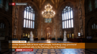
News Channel and Clock
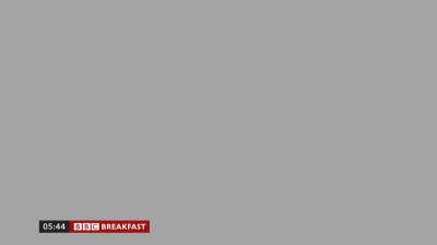
BBC Breakfast and Clock

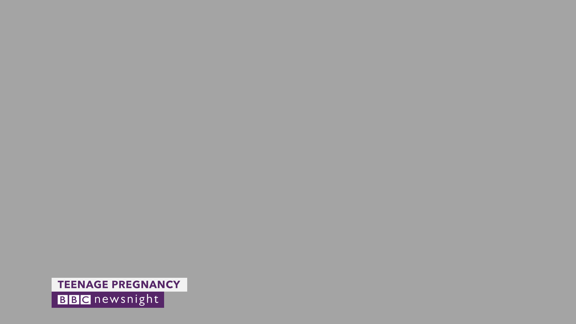
Newsnight
Straps and Captions

Newsnight - VT Package Title Caption

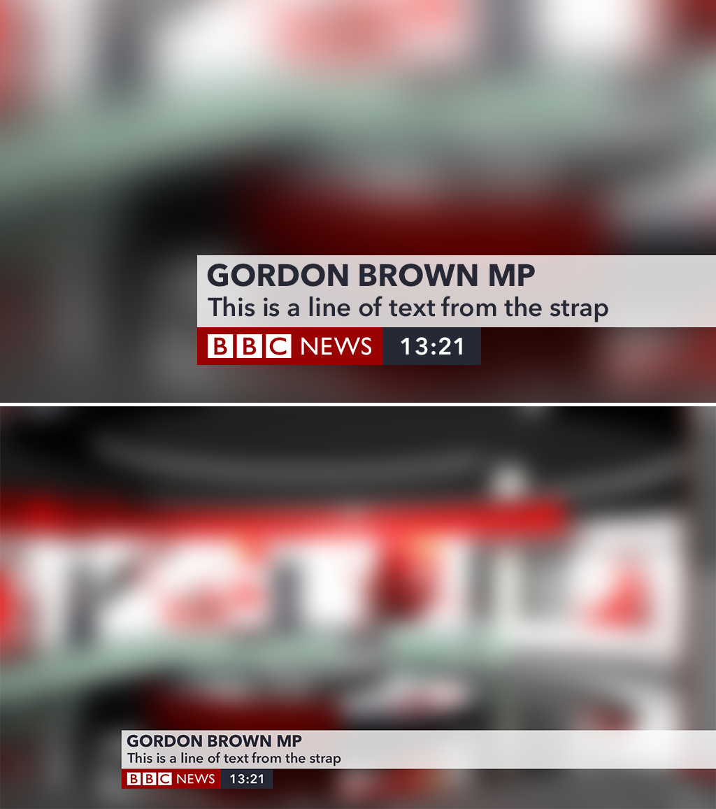
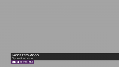
Normal Name Strap
Blurb Information Strap
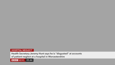
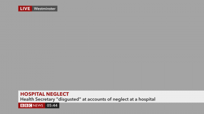
Detailed Information Strap

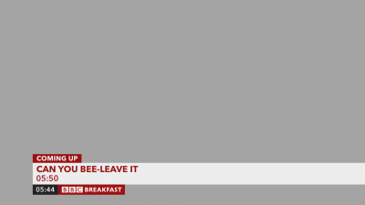
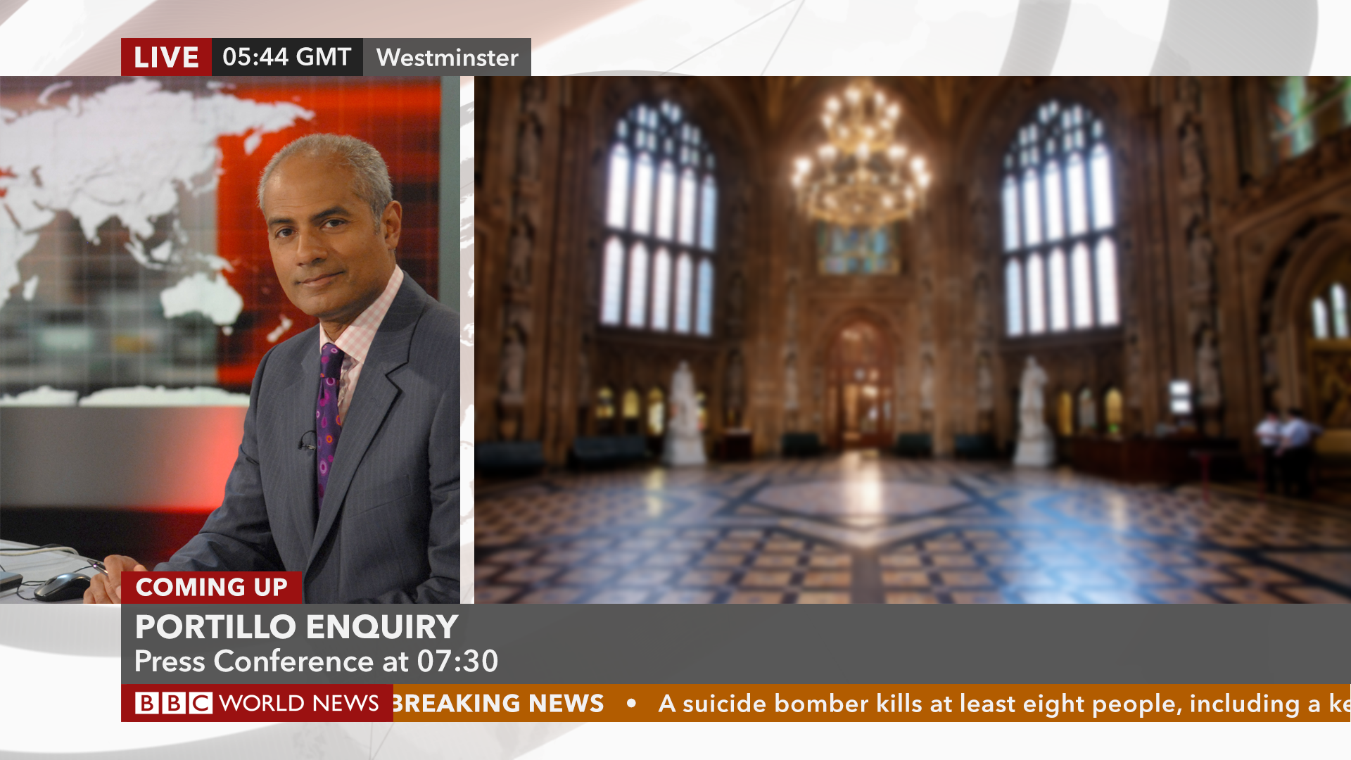
Coming Up Event
Coming Up programme schedule
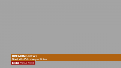
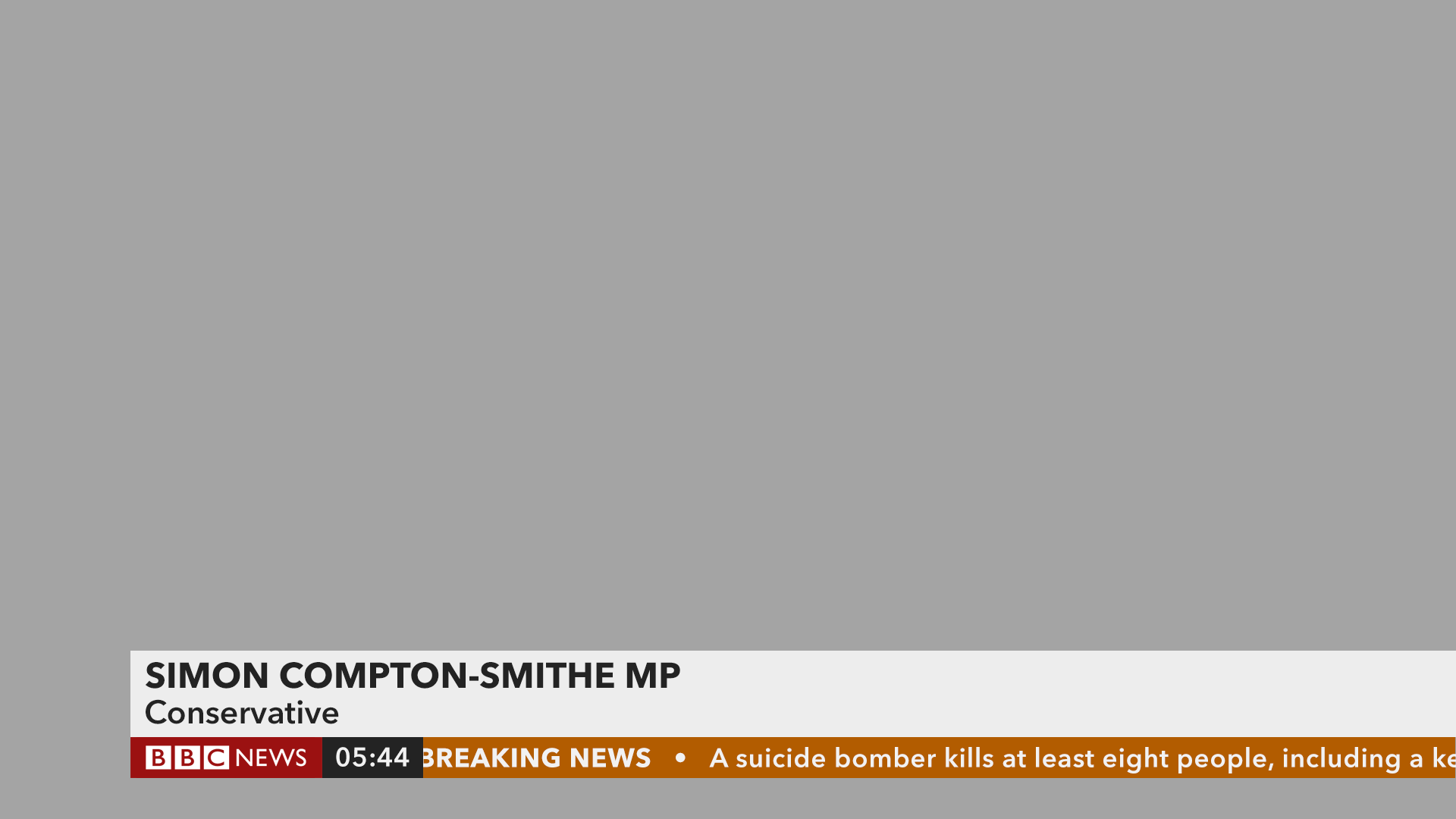
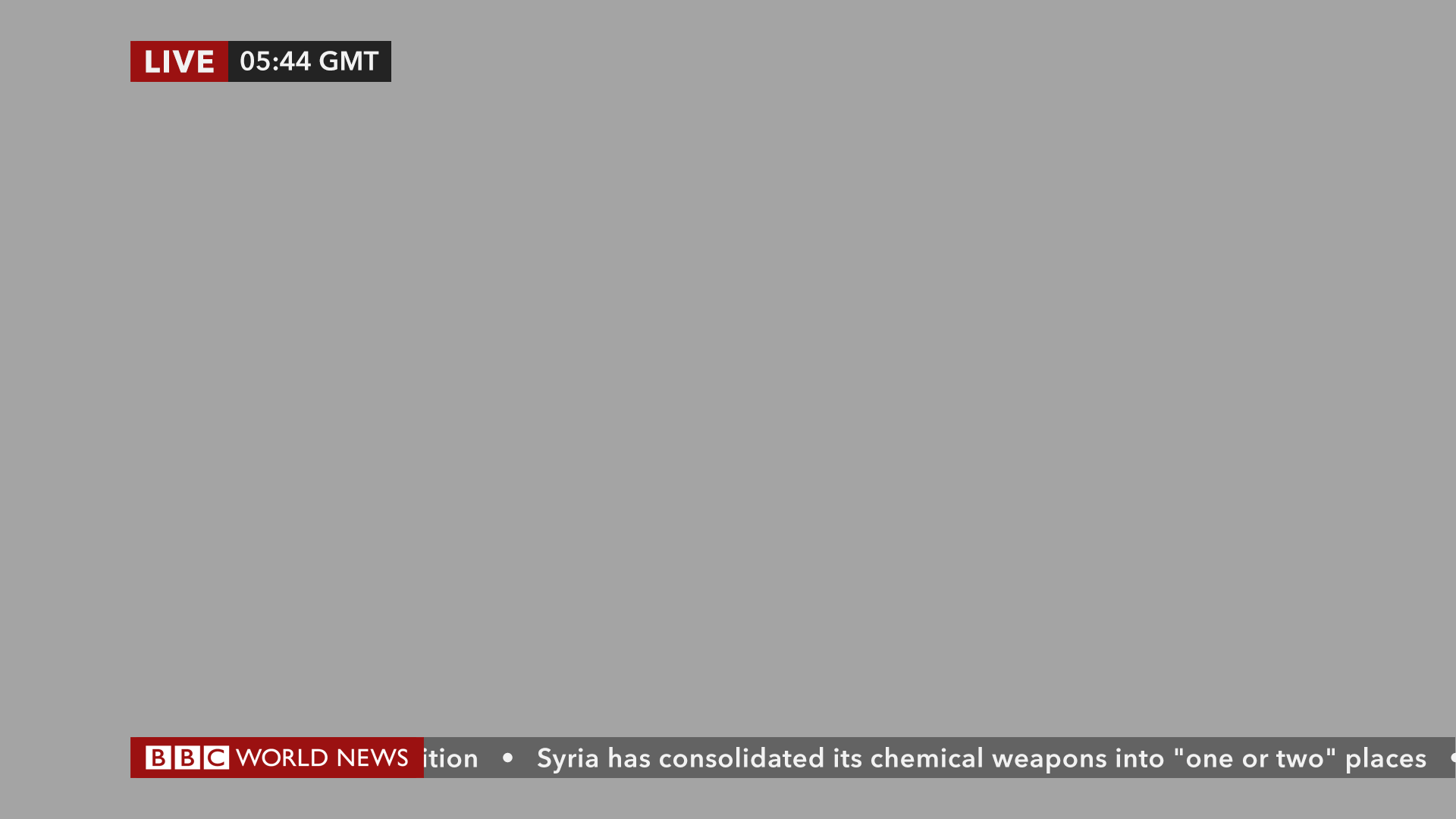
Breaking News Flash

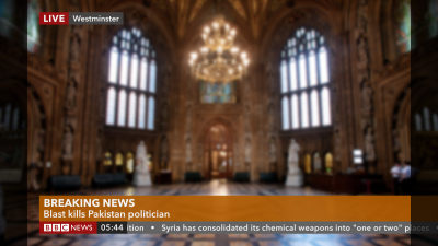
Breaking News Detailed

World News Programme - Name Strap
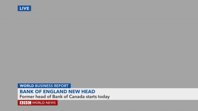
World News Programme - Blurb Strap
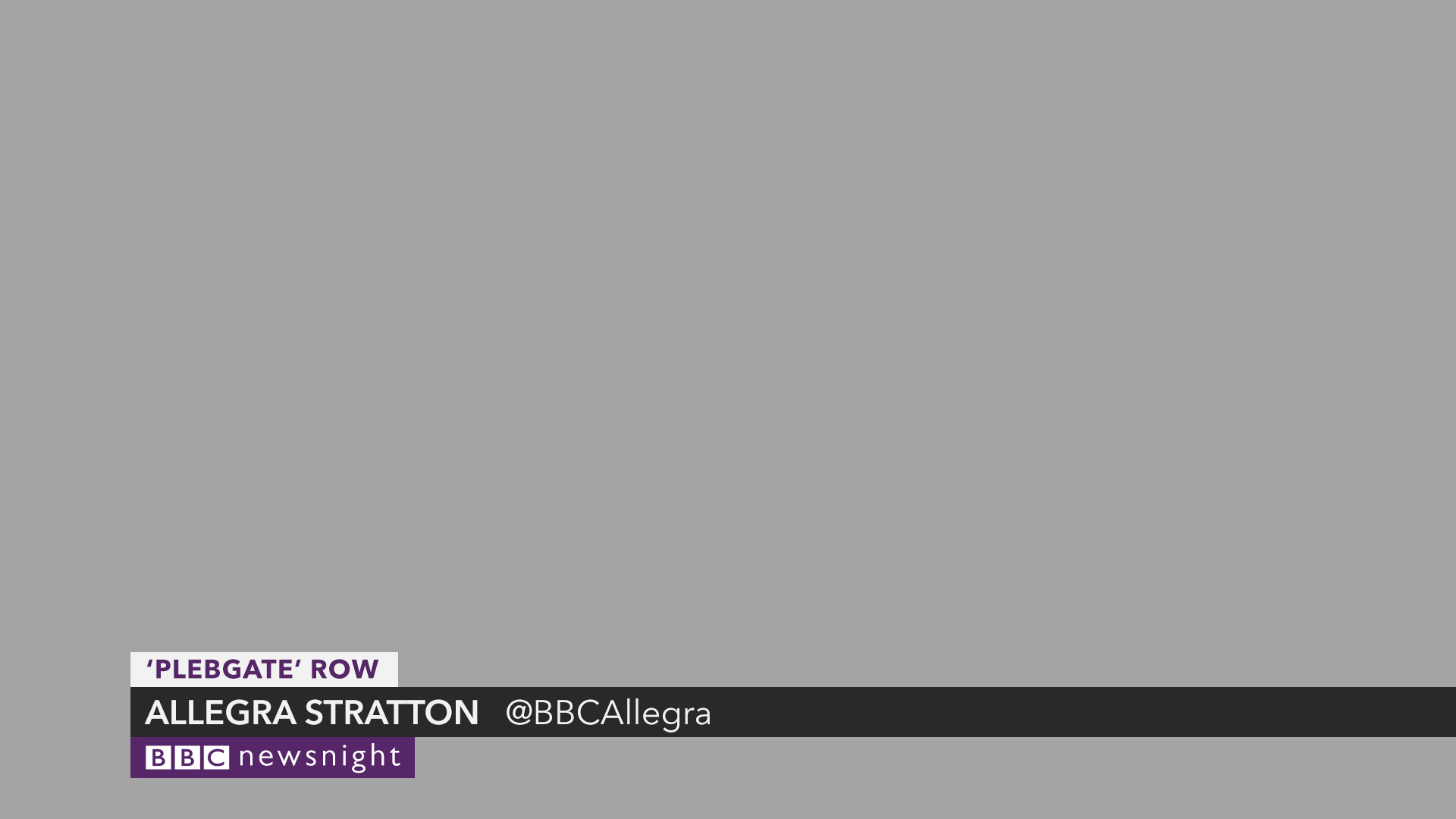
Newsnight - Name Strap
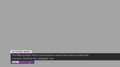
Newsnight - In Other News roundup strap

Newsnight - VT package reporter strap
Top Graphics
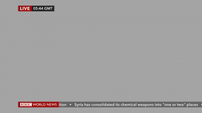
Live Shot - With Local Time
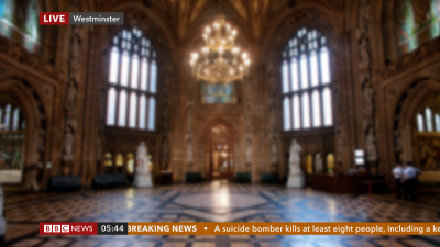
Live - With Location

Graphic + Live - With Local Time and Location
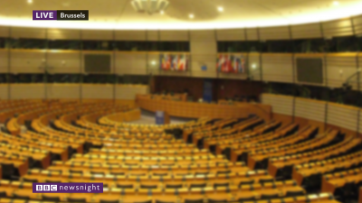
Newsnight - Live with Location
Framing and Safe Areas

Graphics are designed to be 14:9 safe, for the HD feed, SD feeds could have separate graphics but 14:9 safe is pretty safe nowadays.
14:9
4:3
UPDATE:
Added video of my updated design
So here is how I would move from the current graphics, to HD versions. Hopefully they are cleaner than the current graphics, and are nicer in HD using the Avenir font (same as BBC Two) to replace Gill Sans. Swiss/Arial/Helvetica looks generic and dull, and does not fit the rest of the BBC News branding IMO.
Channel/Programme DOGs

Channel logo without enclosure

Channel logo

National News, News Updates etc

News Channel and Clock
BBC Breakfast and Clock

Newsnight
Straps and Captions
Newsnight - VT Package Title Caption
Normal Name Strap

Blurb Information Strap

Detailed Information Strap
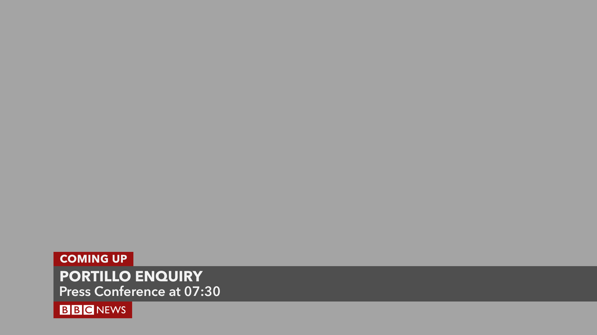
Coming Up Event
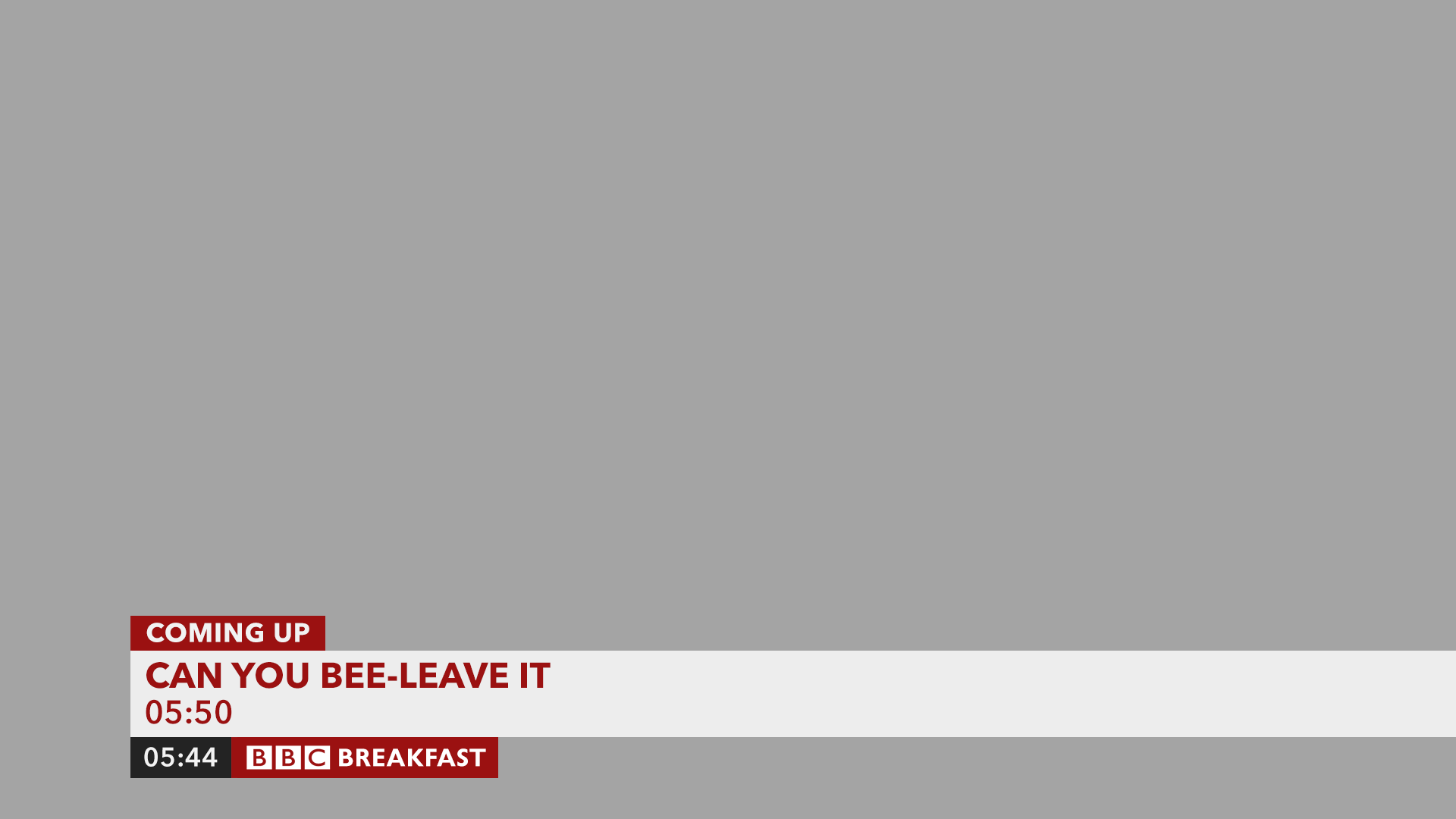
Coming Up programme schedule

Breaking News Flash
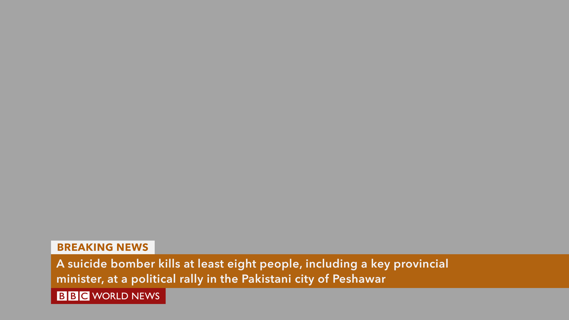
Breaking News Detailed
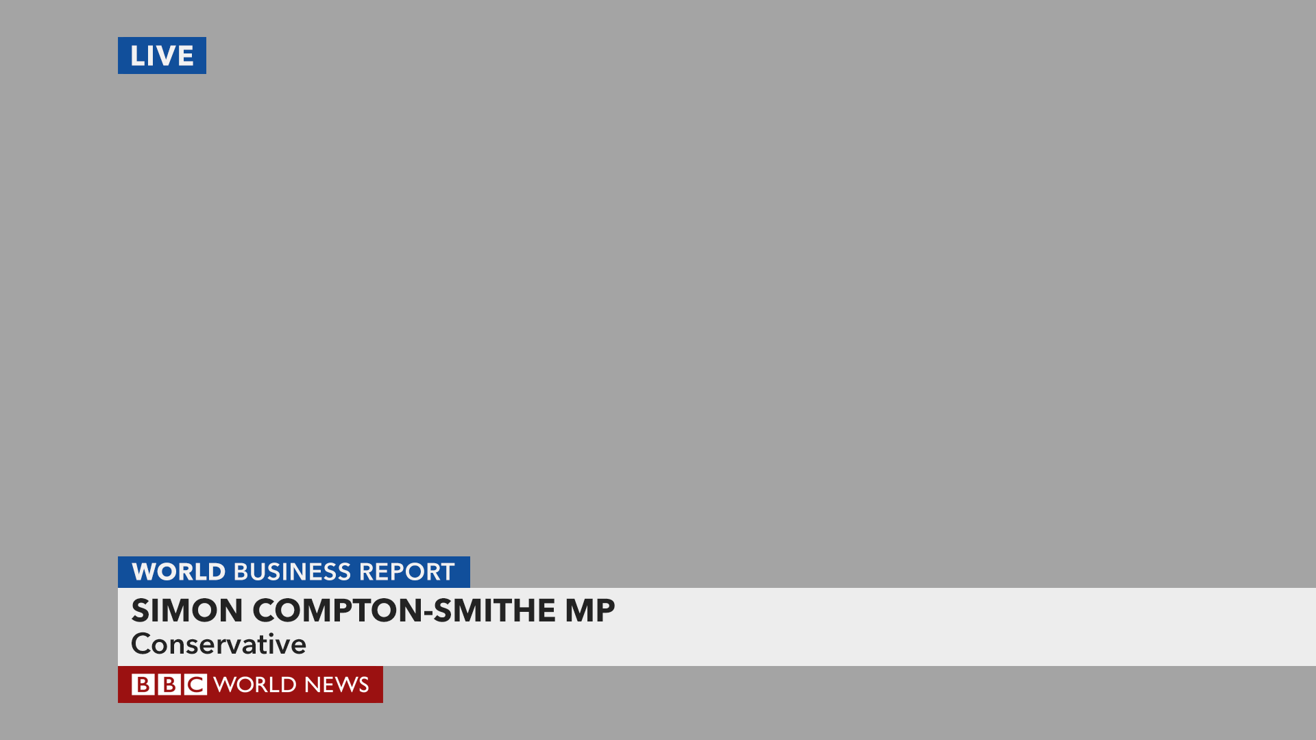
World News Programme - Name Strap

World News Programme - Blurb Strap

Newsnight - Name Strap

Newsnight - In Other News roundup strap
Newsnight - VT package reporter strap
Top Graphics
Live Shot - With Local Time

Live - With Location
Graphic + Live - With Local Time and Location

Newsnight - Live with Location
Framing and Safe Areas

Graphics are designed to be 14:9 safe, for the HD feed, SD feeds could have separate graphics but 14:9 safe is pretty safe nowadays.

14:9

4:3
UPDATE:
Added video of my updated design
Last edited by mdtauk on 31 December 2012 8:20am - 3 times in total