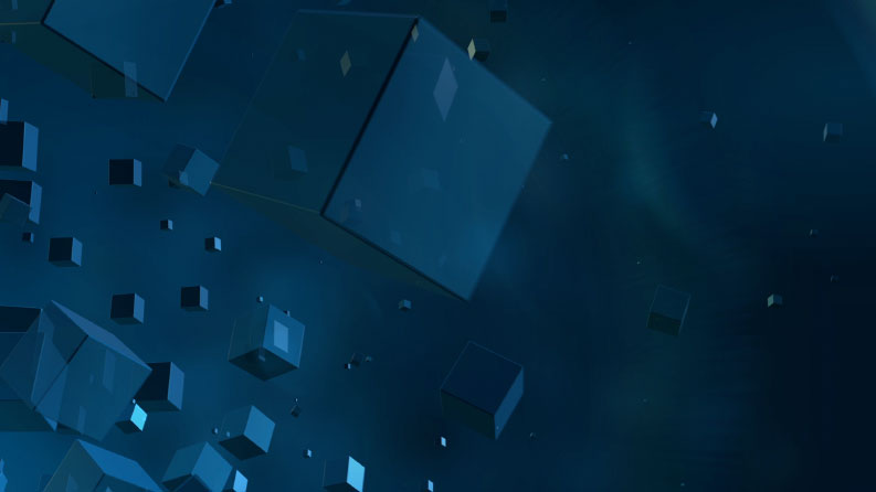
I made this one some time ago but never got round to uploading it. I was playing with the settings in Element 3D and produced what looked like the old ITV News blocky globe monster thing from around 2004. So I worked on it and came up with this.
Ideally I'd have the map graphics on the front side of the blocks, but I can't figure that out just yet. Instead, it's just a rather simple idea mixing the blocky globe from 2004 with the logo and music of today.
I sort of played with the idea that the blocks would roughly end in the position of the hands of a clock depending on the time of the bulletin, a little bit like the Channel 4 idents.
The most important thing about all of this is the inclusion of LENS FLARES.
Another fantastic mock Lee! Can't think on what you should improve on, 5 stars mate!
JD
JDN
Looks good, although it looks good as a background, and not for titles. If you look back to 2004, the squares was there, plus you had a globe and other line features. It's just a tad too plain to be main titles.
I like it. I'd be interested to see how the wider graphics would work, e.g. split screens, and I personally would prefer the 'at' in 'News at Ten' to not be italicised, but otherwise, excellent work.
Looks good, although it looks good as a background, and not for titles. If you look back to 2004, the squares was there, plus you had a globe and other line features. It's just a tad too plain to be main titles.
But it does look good.
I have to agree.
No one can ever fault your abilities, Lee, at creating brilliant graphics and sequences.
But as always, we should treat mocks on whether they're better than what we have now. I'd argue not. It is fundamentally, as said, extremely plain, and basically just blocks moving about. It needs much more substance.
I don't believe this is your best work, but that's simply because you've set the bar so high in the past!
It's a rare treat to see a mock this good, so I think it's only fair that I try to give some feedback other than "excellent".
One aspect of this mock that I particularly like is the distinct colour separation between the bulletins, especially the purple for News at Ten implemented in such a way as to not ape Newsnight.
The ethereal effect achieved when the blocks almost dissolve into the background gives the titles an air of quality and authoritativeness that's unmistakeable. Applied properly, I think revisiting the map idea should make these even better - with the way you've designed it, I can see a map composed of points of light coming from the blocks as working. To be honest, it's that good that just having the News at Ten blocks emblazoned with the Many Faces of Tom Bradby wouldn't do it too much harm.
I also like the fact that whilst you've taken design cues from past brands, it is also an evolution of the current design - 2D and 3D blocks aren't that far apart. The unfussy, modern aspect of the current design is nicely carried over too, without being overly simplistic.
The theme music doesn't seem to mesh as well as it does with the current titles (not that the timing is wrong - it's bang on); I think that's simply a matter of the current titles' sharper movements fitting in with the style of the music. For that reason, the News at Ten theme variation seems to be a more natural fit, as the current 3D titles are less jaunty in their movement.
The attention to detail is excellent too - the little throwback with the italicised "at" in the News at Ten logo alone is a great touch.
I don't agree with some of the feedback here - I don't think it's worse than what we have now; given your rationale for the design and what you plan to add, I also don't agree that it lacks substance.
Ultimately, the simple fact I want to watch the video you've posted again and again is a sign that it's a mock that would be more than suited to being on TV, in my opinion.